

In just a few years, “responsive” has gone from a buzzword to the industry standard in website design — and with good reason. Responsive design offers significant advantages over traditional design, allowing for SEO improvements, streamlined development, and, of course, better user experience across different devices.
Why Your Website Needs To Be Responsive
One of Google’s goals is to provide a better user experience for all of the folks searching on their mobile devices. Think of the last time you accessed a site on your phone and tried to click on a button to navigate but hit the wrong one. Then you had to hit the back button and zoom in just to try to click the correct link, only to miss again and hit the one next to it. Super frustrating, right?
Thus, a few years ago, Google rolled out changes that altered search results on smartphones and tablets in an attempt to change the best practices for web design to include mobile display and usability. In response, many businesses designed their website to be responsive — the ability to be viewed on different size tablets and mobile phones.
And today more than ever, B2B users expect the companies they do business with to provide the same digital experience as the personal websites they shop on like Amazon and Walmart — it's the shift to direct-to-consumer selling and another reason why your website needs to be responsive.
To help manufacturers and industrial companies appeal to more buyers, engineers, and procurement managers online we’ll break down the basics of responsive design and offer some proven best practices.
Basic Step To Begin Your Responsive Website Redesign
1. Focus On The Content
What does content have to do with website design? A whole lot.
When potential clients visit your website, they’re not looking for a pretty banner or great graphics; they’re looking for the content you have to offer.
Make sure all your valuable content is easy to find, even when screen real estate is limited. Do this by ensuring that the header of the content and the content itself are visible on mobile devices without the need to scroll. (You have some leeway on larger screens, but don’t abuse it).
Remember what the user is really looking for — strong content that helps them get their jobs done that’s easy to find and just as easy to navigate.
Learn More: How To Create Website Content That Engages B2B Buyers
2. Get To Know The Media Query
The backbone of responsive design is the ability to shift and format content depending on the size of the screen. In technical terms, this is known as “the media query.”
This terminology evolved from the term “media type,” which is a style sheet that determines how a piece of content is presented on different physical media, such as a screen, paper, or Braille device.
Media queries work similarly. However, instead of detecting the type of physical media, a media query detects the size of a screen. The website then decides to render a specific style sheet for that specific screen size.
When considering a website redesign, keep in mind that you don’t want to limit your website to just three sizes — desktop, tablet, and mobile. Instead, you’ll want your site to scale appropriately for screens of all sizes, no matter their dimensions. That’s what a media query accomplishes.
3. Keep A “Mobile First” Mentality
When designing a responsive website, start with mobile styles as your foundation and add additional columns and styles with media queries. This way, if someone lands on your site using a device or browser that does not support media queries, they will be able to see the mobile version of your site.
This is considered best practice for a couple of reasons:
- “Mobile first” design helps you focus on what really matters and accounts for limited screen real estate and limited attention spans. Maybe that random image of a truck on a highway isn’t really necessary after all.
- “Mobile first” design helps broaden your reach to devices that don’t support media queries.
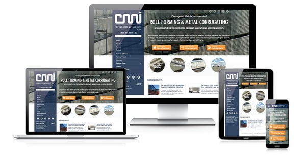
Learn how Corrugated Metals increased leads by 285% after updating to a responsive website

4. Create A Flexible Foundation
Are you familiar with set-width and fluid grids? The biggest difference between the two is the way they calculate the widths of elements on websites.
- A set-width grid calculates the sizes of elements by pixels.
- A fluid grid calculates the sizes of elements by percentages.
One of your main goals with responsive design is to make sure your images don’t exceed the width of the container and that they stay in line with the fluid grid. (You may come across websites that claim to be responsive, but if you see a horizontal scroll bar, they aren’t. Rigid images are most likely the culprit here).
In the early days of responsive web design, developers would use popular screen sizes that adjusted their set widths accordingly. This doesn’t work anymore — unless you plan to adjust your website’s width to the countless types of devices and computers out there (and the hundreds of others that get released every month). Add codes that will force the page into the size of the screen available, which means text will wrap, and there will be no horizontal scroll bar.
Sound too complicated to tackle? Request our Free Digital Health Check and we'll let you know exactly what you need on your website to attract more qualified prospects and turn them into customers.

5. Don’t Neglect The Navigation
Navigation is one of the most important assets of a website. Unfortunately, it’s also one that most “responsive websites” get wrong. Don’t fall into this trap!
You don’t want your navigation menu to get in the way of important content, but you also want to make sure your visitors can navigate easily no matter what device they are using. So, you need to strike a balance by making your site’s navigation as intuitive as possible without making it obstructive.
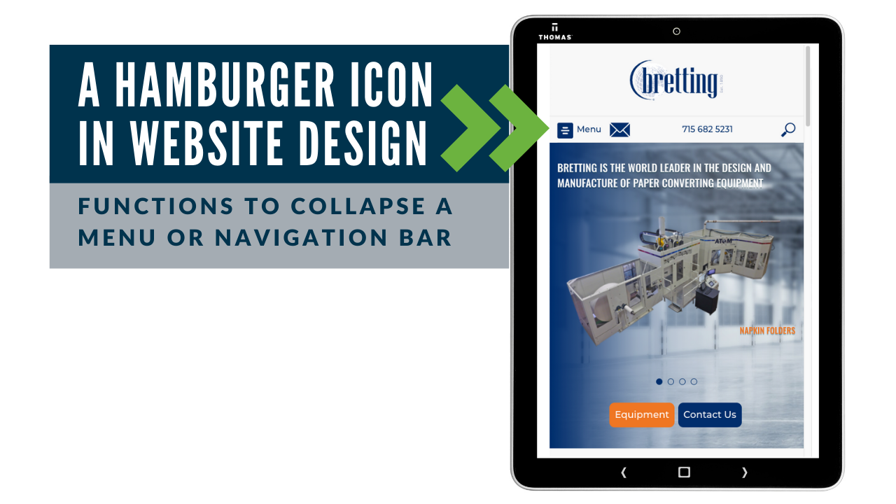
It’s best practice to hide the navigation menu on smaller screens while allowing visitors to access it when necessary. This is accomplished with the “hamburger icon,” which has become the universal symbol for navigation. The visitor understands that they will see the full navigation menu when they tap this icon. See how a Bretting, an OEM of paper converting equipment, designed their navigation to be responsive below — plus, more website design examples here.
You'll want your text to be read easily across all devices. For font sizes, there are a few website design recommendations. The default size is 16px with a minimum of 12px. For line height, Google's Material Style Guide recommends a 1.5 line-height.
6. Optimize Your Assets
We cannot emphasize enough the importance of ensuring all your content — images, videos, PDFs, etc. — are fully optimized for all screens and devices. Having large assets that take too much time to load is probably the number-one reason visitors bounce from a site.
Thomas Tip! We offer free video production services with an advertising program and we'll make sure it's optimized on your site and online channels — learn more.
Today's newer technological capabilities enable engineers to find and build the part they need online, download a 3D model, insert it directly into their design, and immediately assess its fit. Don’t make your customers wait to download a 6-megabyte product image when a 300-kilobyte version would do and take a lot less time. They're on your website because they have a job to complete — don't let slow load times be why they move on to a competitor. Also, keep in mind that many mobile visitors have limited data plans, and you don’t want to inconvenience them (and their budgets) by serving up oversized files.
You Might Also Be Interested In: How CAD Models Drive Lead Generation
7. Make Your Website “Touch-Friendly”
With people browsing more and more frequently on mobile devices, they are sacrificing the accuracy of a mouse or stylus for the convenience of using their fingers.
Therefore, every interactive element of your site — links, buttons, CTAs, etc. — needs to be “touch-friendly.” Use a proper size for the height of your buttons. We recommend a minimum of 10mm. Your targets that are large enough, and fluid enough make browsing your site as seamless and easy as possible.
8. Pick The Right Content Management System (CMS)
Ever since “responsive design” entered the marketing lexicon, companies have been launching new responsive CMS platforms at a seemingly nonstop pace.
While these new CMS offerings may have some enticing features, we wouldn’t recommend them, because just as quickly as these companies spring up, they can also shut down.
Make sure you go with a flexible and reputable CMS with a large audience and a good pool of developers. This will ensure your website gets the support it needs for years to come. Consider a strong platform like WordPress that offers mobile templates for you to choose.
Trending: WordPress Vs. Wix, What's The Best Platform For Manufacturers?
9. Invest In Testing Tools
Just because your responsive website looks great on your computer and smartphone doesn’t mean others will have the same experience.
You need to keep tools on hand to make sure your site is ready for everyone, everywhere. You might have the capability already to preview where you build, but why not test elsewhere to make sure you’re on point? The key to a successful website that helps you get more business is to update it regularly and test your efforts.
Learn More: A/B Testing Examples For Manufacturers
Outsourcing Your Website Redesign
You may be paying for it, but your website isn’t really for you. It’s for your prospects and customers to understand the full value and quality of your company. Whether buyers discover your site from an online search or while sourcing on Thomasnet.com, they should be welcomed with an optimized, high-quality web presence.
Manufacturing company profiles on the Thomas Network let engineers and procurement managers partner with the right suppliers fast.

"With Thomas running our website, lead generation efforts, and marketing, our sales increased by 60% in just one year," said CJ Winter. "Thomas maximized our company exposure, drove a record number of qualified leads, and helped us turn these opportunities directly into sales dollars."
Following these nine steps won’t make you a design expert overnight, but they will guide you in creating a content-focused, user-friendly, and optimized responsive website that helps your buyers get their jobs done.
If you have any questions on responsive websites, or are interested in digital marketing advice, feel free to contact our team of engineers, technical writers and web strategists to help with your website redesign. We will build content and design your website based on the personas you want to do business with and the experience you want your customers to have. And ask us about our free Digital Health Check that lets you know exactly how you can improve your website and how it compares to competitors.
For more website design resources, check out:
- 10 Step Checklist To Begin Your Website Redesign
- 9 Best Industrial Website Examples
- For Manufacturers: Why Should I Update To A Responsive Website
- 25 Website Must-Haves To Generate Leads
- Distributor, OEM, and Industrial Company Website Design Examples
- Website Basics For Manufacturing Companies
- How To Sell Industrial Products In A B2C World
Industry-focused website resources for more inspiration:
- 5 Industrial Website Examples For CNC Machining Companies
- 3 Must-Have Lead Generation Examples For Steels And Metals Companies
- Private Label Manufacturing Website Design Examples

Did you find this useful?


