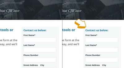
A/B Test Example: The Arrow That Increased Form Submissions
Many manufacturers and industrial companies create a website and leave it untouched for months or even years and wonder why it isn't bringing in any high-quality leads. While an online presence is important to have, it is equally important to track your efforts and make continuous updates to your website to see where you can improve. Creating a new website and investing in digital marketing is not a one-and-done approach. But with patience and the right marketing team in place, it can increase lead dramatically.
Read one to learn how a cold-root rolling manufacturer increased online leads by 75% after implementing a simple design change on their landing page.
A/B Testing An Arrow
Our conversion experts came across studies which showed that directional cues are effective at drawing attention to different objects on a page. While these cues can take many forms – arrows, eyes, fingers, etc. – independent research by the folks over at ConversionXL showed that hand-drawn arrows were the most successful.
Read More »
Left vs. Right Aligned Forms On Landing Pages
If you've ever wondered whether the forms on your landing pages should be on the left or right side of the page, you're not alone.
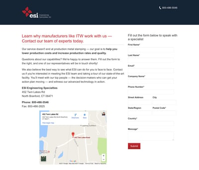
We decided to put this to the test on the contact page for one of our client's who specializes in custom metal stamping, Engineering Specialties, Inc. Now, you may be thinking that a small change such as which side of the page a form is on would have little difference in lead generation, but on the contrary, we've seen even simpler tweaks like adding an arrow above a form convert like crazy.
So, are you ready to see which side of the page the form should go on?
Read More »


