Left vs. Right Aligned Forms On Landing Pages
Kyle Shope August 19, 2017
If you've ever wondered whether the forms on your landing pages should be on the left or right side of the page, you're not alone.
We decided to put this to the test on the contact page for one of our client's who specializes in custom metal stamping, Engineering Specialties, Inc. Now, you may be thinking that a small change such as which side of the page a form is on would have little difference in lead generation, but on the contrary, we've seen even simpler tweaks like adding an arrow above a form convert like crazy.
So, are you ready to see which side of the page the form should go on?
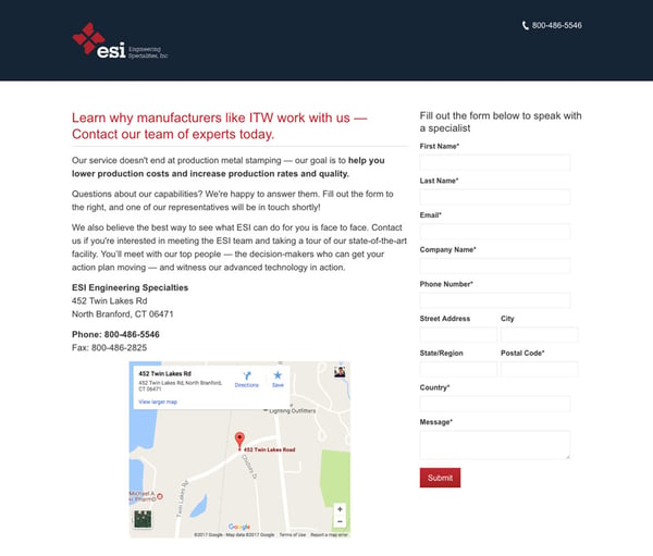
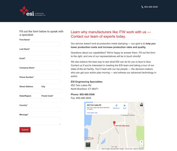
Here's screenshots of our two variations below — it's pretty simple, the only thing we changed was the form being on the left vs the right.
Variation A - Right Aligned

Variation B - Left Aligned

The Result
Form conversions
This is a measurement of the number of visitors that successfully complete the form. The conversion rate went from 4.7% to 8.1%, a 75% increase!

Bounce rate
This measures the number of visitors that immediately leave the page without engaging with the website. While there is a slight drop, which is a good signal, we only achieved a 70% confidence interval for this metric so we can't rely on this data alone.

Final thoughts
According to the data, it's evident that the left-aligned form outperformed the right-aligned form on this contact page by 75%. The bounce rate, which is not our primary metric but still a good indicator, also favored the left-aligned form.
While it may be tempting to say that a form on the left is hands-down better than a form on the right, keep in mind this is only one test on a specific landing page.
From our repeated trials and experiments, our team has noted that left-aligned forms consistently outperforms right-aligned forms on contact pages only.
For more general marketing offers such as eBooks and whitepapers, however, we've seen decreased effectiveness and would strongly suggest testing because your specific industry may behave differently. Our theory is that people expect a form on a contact page and are subconsciously primed to fill it out, so prompting it immediately (as we read left to right) increases submissions. On more general landing pages, however, a form is not necessarily expected, hence the mixed results.
As always, test to validate your assumptions and don't just rely on our data. If you're not in a position to set up and implement these kinds of tests on your own, reach out to our website team.
Did you find this useful?


