A/B Test Example: The Arrow That Increased Form Submissions
Kyle Shope October 17, 2018
Many manufacturers and industrial companies create a website and leave it untouched for months or even years and wonder why it isn't bringing in any high-quality leads. While an online presence is important to have, it is equally important to track your efforts and make continuous updates to your website to see where you can improve. Creating a new website and investing in digital marketing is not a one-and-done approach. But with patience and the right marketing team in place, it can increase lead dramatically.
Read one to learn how a cold-root rolling manufacturer increased online leads by 75% after implementing a simple design change on their landing page.
A/B Testing An Arrow
Our conversion experts came across studies which showed that directional cues are effective at drawing attention to different objects on a page. While these cues can take many forms – arrows, eyes, fingers, etc. – independent research by the folks over at ConversionXL showed that hand-drawn arrows were the most successful.
Running The A/B Test
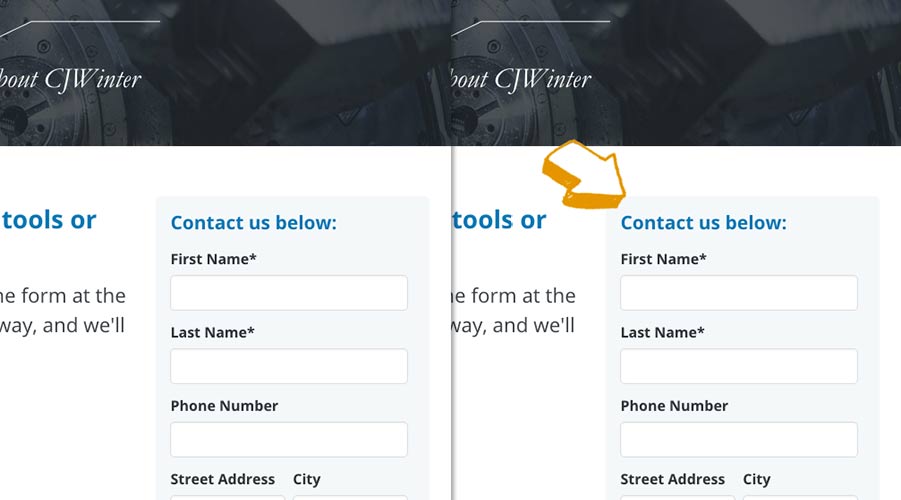
Thomas Marketing Services ran an A/B test on all of the manufacturer's landing pages. The only difference between the two versions was that, on the B pages, we added a hand-drawn, slightly cartoonish yellow arrow on the top-left hand corner of every form. (See how it looked below.)

Results Of The A/B Test
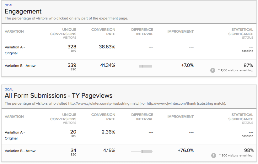
We found that adding this simple yellow arrow increased engagement (clicking anywhere on the page) by 7%, which indicates that the arrow helped increase general interest in the site's content.
Even better, we also saw that form submissions, as measured by the number of people successfully submitting the form and being redirected to the thank you page, saw a whopping 76% increase.
Related Resource: A/B Testing Examples For Manufacturers

The key takeaway from this experiment was that directional cues, like an arrow, can effectively draw attention to elements you'd like to highlight on your pages.
While it's difficult to pinpoint why adding the arrow worked so well — it may be because the yellow color stood out, or it may be because people simply like hand-drawn arrows — it's clear that the method can be effective.
Consider A/B testing the impact of arrows on your own engagement and conversion rates. Download our 25 Website Must-Haves to learn the exact website components you need to increase more leads. Then talk with one of our digital marketing experts to put the plan in action.
Did you find this useful?


