Key Elements Of An Effective Website Design For Manufacturers
Juliette Ferraro September 22, 2021
When it comes to industrial marketing, first impressions are incredibly important. You need to instantly build trust and credibility with potential customers, lest they take their business elsewhere. That's why updating and maintaining your manufacturing website is so critical — it's often the first point of interaction buyers have with your company.
Web Design Elements For Manufacturers
If you want your website to help you attract prospects, generate leads, and win new business, you need to pay attention to these core elements of website design.
1. HTTPS Encryption
While this technically isn't a "design element," it should be one of the most important components you tackle before anything else for your website. Your customers are more concerned about privacy and data security than ever before. Moving your site from HTTP to HTTPS and adding SSL encryption to your site is a simple, affordable, and effective way to safeguard your visitors' information and keep your business' data from cybercriminals too.
Learn More About Website Security: Information Technology Challenges For Manufacturers
2. A Clean Layout
Great design is all about simplicity; you don't want to get in the way of your visitors. If there's too much going on — lots of confusing colors, mixed messages, overwhelming visuals, complicated menu structures, competing popups, etc. — then people are more likely to get turned off. Instead, you should embrace white space, and keep your color scheme simple while ensuring the right elements — like calls to action — stand out.
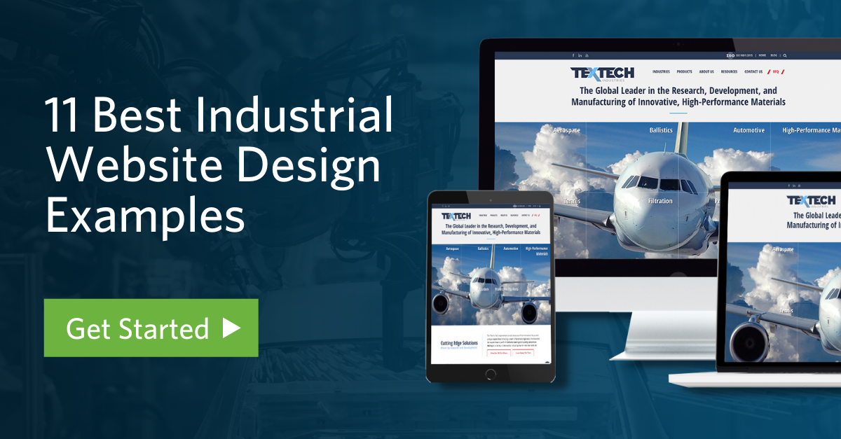
Notice how in the example below, TexTech industries' homepage is designed for their main target audience, the aerospace industry. The layout and colors represent their brand colors well and the RFQ button is in a contrasting color to encourage visitors to click it.
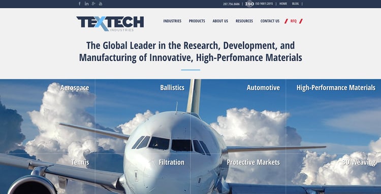
"Diversified content on our site has really helped us stand out as a leader in the industry," said Eoin Lynch, Executive Director of Sales and Marketing at Tex Tech Industries. "Some aerospace technology can be complex, but the content on our website breaks it down for buyers to understand what they need and how we help them." Read on to learn more about creating unique website content.
Learn More: 11 Content Marketing Examples For Your Manufacturing Website
3. Branded Elements
Your website is the digital reflection of your industrial brand, and it should accurately and positively represent your company. That means sticking to your core color scheme, utilizing a crisp and high-resolution logo, and working in your core messaging and value proposition.
4. Mobile Responsive
These days, more business is done on mobile devices and tablets than on traditional desktop computers. That's because more than 70% of today's industrial buyers are millennials. They're tech-savvy and expect the same B2B buying experience as in their personal lives (think Amazon). That means your website needs to work on cell phones and tablets and have fast-loading pages.
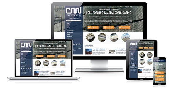
Having a responsive website ensures your site looks great across all devices and screen sizes and ensures it stays at the top of search results. Google favors websites that provide a great user experience.
Get Started:
- How Fast Is Your Website? Get A Free Digital Health Check [Custom Report]
- 9 Beginner Tips For Responsive Website Design
Corrugated Metals partnered with Thomas to build a responsive, lead-generating website as seen in the graphics above, and it changed the way they market their business. "We set a record for quotes in Q1, increasing them by 197% over the previous year and the average value of quotes has grown. The sales team can’t believe how many good opportunities they have now," said Ken Carlton VP at Corrugated Metals. A responsive website keeps people on your site longer — and the longer they're on your website, the more likely they will do business with you. Get a free digital health check review of your website to see what you need to generate more qualified leads online.
5. Intuitive Navigation
Navigation is an often overlooked aspect of web design, but it is an element that can make or break your success. You need to ensure that getting around your site is as intuitive and straightforward as possible, so that visitors can find the content and information they need without getting lost, and without getting frustrated.
6. Product Catalog Capabilities
Complex products can have thousands, or even millions, of different configurations. Making configuration technologies available on your website can make it much easier for visitors to input their exact needs to get a head start on finding the configuration that will work for their project. Product configuration makes it easier for customers to purchase the exact products they need, and suppliers to engage them earlier in their project to offer any necessary engineering insight. They also reduce the need for intensive customer service and engineering calls and help to establish your brand as a resource for engineers and procurement professionals. It's a top digital customer experience trend manufacturers have been embracing this year.
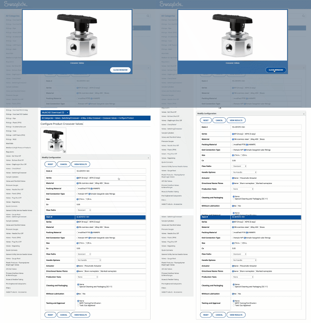
An organized online product catalog retains more customers and should be a fundamental aspect of your website. To learn more download our free eBook, The Manufacturers Guide To Building Effective Online Product Catalogs.
7. Contact Us Page
You want prospects to get in touch with you, right? Make it easy by having a comprehensive contact us page that provides every possible way to reach you — form, phone number, email, and mailing address. Make sure to include a link to the page in your navigation menu so that visitors can access it quickly.
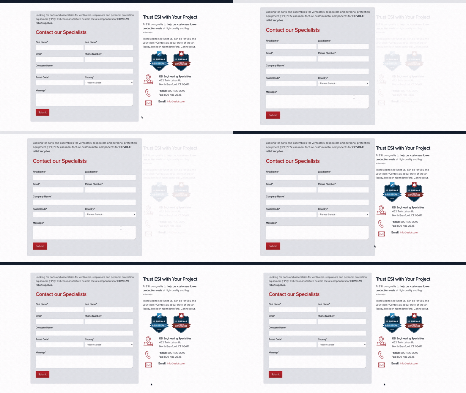
Below is an example of a contact us page that converts well that includes some elements that follow best practices. Off the bat, ESI provides Contact Us Page visitors multiple options to get in touch with the company including, a form, an email, an address, and phone and fax numbers. The H2 on the page, "Trust ESI with Your Project," along with Thomas Registered and COVID-19 Response badges, enforces that ESI is a trustworthy and reputable company to partner with.
Related: How A Manufacturer's Logo Design Engages BuyersSomething unique that ESI implemented on this page is a "form focus." This is an effect triggered by mouse movement so the focus is completely placed on the form. Our Thomas Marketing Services conversion rate optimization experts run tests on industrial customer websites to make data-driven decisions and encourage more website clicks. Because of the focus effect, prospects can zero in on filling out the form with little distraction.
8. Easy-To-Use-Forms
On that note, a beautiful, well-written, and easily navigable website is great. But if you're not capturing any leads through CTAs and forms, then your website isn't doing its job. Forms are the primary lead capture tool on your website, and they can't be treated as an afterthought. Implement A/B tests to make sure you're using the most engaged-with components.
Here are some common questions that industrial marketers have where A/B testing can help answer:
- Do prospects prefer red or blue CTAs?
- Should headlines lines be written as questions or statements?
- Is it better to put your forms on the left side of your landing pages or the right? (We A/B tested the placement of forms here.)
The layout, length, and structure of your forms can play a significant role in the effectiveness of your lead generation efforts and the quality of your website design.
9. Unique Content
Offering compelling content is the best way to ensure that visitors stay on your site, learn more about your company, and, ultimately, convert into customers. Take the time to develop sharp website copy, engaging blog posts, and actionable eBooks.
Use Videos To Keep Buyers On Your Website Longer
Perhaps one of the best formats to engage buyers searching for the products and services you offer is video. With limited in-person sales opportunities, trade shows, and factory tours, businesses have taken advantage of video advertising on Thomasnet.com. The reasons why are clear:
68% of people prefer to learn about a product or service through video
65% of executives visit the companies website after viewing a video
39% of executives call a vendor after viewing a video
💡Thomas Tip: Manufacturers Can Get A Company Profile Video Like The One Below Produced For Free With An Advertising Program
Create Industry-Specific Website Pages
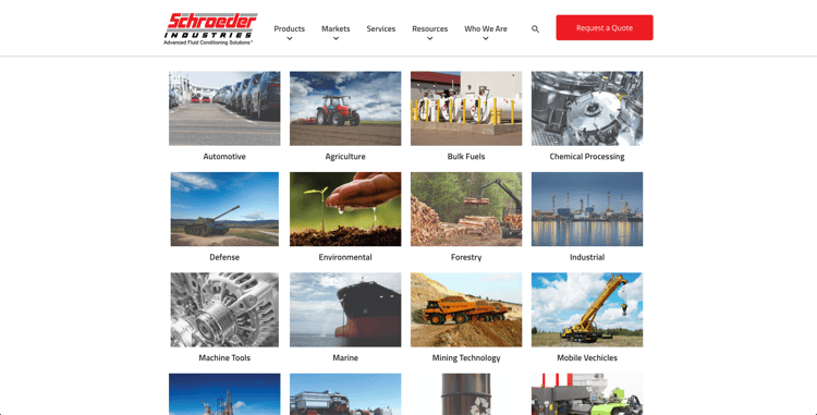
Industry-specific web pages are among the most important types of content to your website and inbound marketing arsenal. They serve as your company’s introduction to potential clients in different markets and help your website get found online. Schroeder Industries has a very informative Markets Served page with insight into how their solutions solve businesses problems in an array of markets.
To help give your web copy a bit of direction, here’s a breakdown of the main elements every page should have.
Introduction
Everything should have an introduction. Some are quite brief while others are on the longer side, but they’re always present.
Introductions are important for a couple of reasons. They help ease a reader into your content, ultimately making it more readable — and readable content is content that people linger over. If somebody who accesses one of your web pages can’t figure out what the page is about quickly, usually within about 30 seconds or so, the likelihood that they leave the page increases dramatically. That’s a lost lead.
Introductions can also help to guide readers. A young procurement manager might be a little unsure of what they’re looking for or if they’re in the right place. A good introduction will let them know quickly. And it won’t hold old pros back — a seasoned veteran knows their way around and can simply skip the introduction and head directly to the body.
The Body
The body is the heart of a web page, it’s meat and potatoes.
The goal of a web page (with some exceptions, discussed below) is to provide potential clients with valuable information. Providing such information is the crux of inbound marketing, greatly increasing the chances that plant managers, purchasing managers, design engineers, and other industry pros will want to work with you.
If you have a web page about the benefits of aluminum for the aerospace industry, then the body of your page should be filled with that information, instead of an informal, rambling treatise on the general state of the aerospace industry. A web page about machining capabilities should focus on machining capabilities that you possess, not those you don’t.
Conclusions and CTAs
CTAs, CTAs, CTAs! We’re always going on about CTAs, or calls to action, here, and we’re not going to stop any time soon. That’s because they are hugely important.
You can have a virtually perfect web page but, if you don’t prompt a potential client with an action, they won’t take one. They’ll read your page and go about their business. But if you include a strong CTA, nestled in a brief conclusion summarizing the page, you have a much higher chance of converting a potential client into an active lead.
But every rule needs an exception, and web pages are no different.
One major exception to the guidelines above is landing pages. Landing pages have only one purpose — get a potential client to trade their contact information in exchange for a high-value offer like an eBook.
In this way, landing pages function much more like an email than a web page, and can be much more marketing-centric than standard web pages. They should be roughly the length of an email, too; a short and sweet 150 words or so, as opposed to the roughly 500 words generally recommended for a web page.
Landing pages are portals to sources of information, not the sources of information themselves.
Learn More: Meeting The Needs Of Your Buyers With eBooks vs Blogs
How Effective Is Your Website?
There’s a lot that goes into creating a website that meets your business goals. We should know; we’ve built over 5,000 manufacturing and industrial websites for our clients, so we understand what works and what doesn't. Many manufacturers try to tackle their digital marketing efforts on their own, and while that's okay — there are a few components that can become an oversight.
That's where we come in to make sure you don't miss out on any opportunities. Leave the marketing updates to our industrial marketing experts so you can tackle your other business initiatives. Our team is supported by degreed engineers just like you, so we understand the complexities of your business.
What's Next: 25 Website Must-Haves (With Best Industrial Website Designs)
"We tried other people with our website and marketing but found their focus wasn't on manufacturing, and Thomas is. We get a lot of activity now and steady results weekly — a lot of inquiries thanks to Thomas and our online marketing efforts," said Ron Delfini, President at Engineering Specialties, Inc.
Contact Team Thomas — we offer a free digital health check to see exactly how you can improve your website to get more leads.
You Might Also Be Interested In:
- Private Label Manufacturing Website Design Examples
- 5 Industrial Website Examples For CNC Machining Companies
- 3 Must-Have Lead Generation Examples For Steel And Metals Companies
- The Manufacturer's Step By Step Guide To Building A Strong Digital Presence
- 32 Industrial Lead Generation CTAs Tips, Tricks, and Ideas
Did you find this useful?


